Skip to content
  • 首页
  • GIS理论
  • 二次开发
    • deck.gl
    • leaflet
    • openlayers
    • mapboxgl
    • 百度地图开发
    • ArcPy
    • ArcEngine
    • geotools
    • QGIS
    • cesium
    • ArcGIS
      • arcgis api for javascript
        • ArcGIS API For JavaScript官方文档
        • 3.x
        • 4.x
      • ArcGISServer
  • 算法
    • GDAL
    • PROJ
    • OGR
    • Geotrellis
  • GIS前沿
    • GIS+BIM
    • GIS人工智能
    • GIS大数据
    • GIS新闻
  • 数据分析
  • 前端
    • JavaScript
    • vue
    • es6
    • CSS
    • html5
  • 后端
    • C#
    • Java
    • redis
    • nodejs
    • Python
      • Python教程
      • Scrapy教程
      • Current Page Parent Python数据分析
      • pyspider
  • 操作系统
    • windows
    • centos
    • ubuntu
    • macos
  • 数据库
    • PostGreSQL
    • MongoDB
    • Oracle
      • oraclespatial
    • MySQL
  • GIS数据
    • 数据源
    • ArcMap
    • CAD
    • GeoServer
  • 精选专区
  • 开发工具
  • GIS分析
  • GIS软件
  • 数据中心
  • 源码
  • 登录
  • 注册
  • 版权说明

GIS开发者

gis,openlayers,leaflet,gis应用,geoai,geoserver,cesium,python,arcpy,arcmap,webgis,gis可视化

  • 首页
  • GIS理论
  • 二次开发
    • deck.gl
    • leaflet
    • openlayers
    • mapboxgl
    • 百度地图开发
    • ArcPy
    • ArcEngine
    • geotools
    • QGIS
    • cesium
    • ArcGIS
      • arcgis api for javascript
        • ArcGIS API For JavaScript官方文档
        • 3.x
        • 4.x
      • ArcGISServer
  • 算法
    • GDAL
    • PROJ
    • OGR
    • Geotrellis
  • GIS前沿
    • GIS+BIM
    • GIS人工智能
    • GIS大数据
    • GIS新闻
  • 数据分析
  • 前端
    • JavaScript
    • vue
    • es6
    • CSS
    • html5
  • 后端
    • C#
    • Java
    • redis
    • nodejs
    • Python
      • Python教程
      • Scrapy教程
      • Current Page Parent Python数据分析
      • pyspider
  • 操作系统
    • windows
    • centos
    • ubuntu
    • macos
  • 数据库
    • PostGreSQL
    • MongoDB
    • Oracle
      • oraclespatial
    • MySQL
  • GIS数据
    • 数据源
    • ArcMap
    • CAD
    • GeoServer
  • 精选专区
  • 开发工具
  • GIS分析
  • GIS软件
  • 数据中心
  • 源码
  • Python数据分析

(26)Python箱形图

by giser · 2018-11-28


箱线图是数据集中数据分布情况的一种度量。 它将数据集划分为三个四分位数。 该图表示数据集中的最小值,最大值,中位数,第一四分位数和第三四分位数。 通过为每个数据集绘制箱形图来比较跨数据集的数据分布也很有用。

绘制箱线图

Boxplot可以绘制调用Series.box.plot()和DataFrame.box.plot()或DataFrame.boxplot()以可视化每列中值的分布。

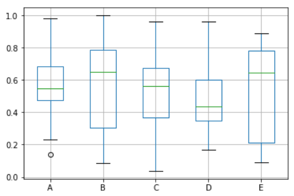
例如,这里是一个箱形图,表示对[0,1)上的统一随机变量的10次观察的五次试验。

import pandas as pd
import numpy as np
df = pd.DataFrame(np.random.rand(10, 5), columns=['A', 'B', 'C', 'D', 'E'])
df.plot.box(grid='True')
Python

执行上面示例代码,得到以下结果 –

 关注右侧公众号,随时随地查看教程
 
Python数据分析教程目录 
Tags: (26)Python箱形图Python数据分析

  • Next story (27)Python热图
  • Previous story (28)Python散点图

You may also like...

  • (28)Python散点图

    2018-11-28

  • (11)Python处理CSV数据

    2018-11-28

  • (38)Python二项分布

    2018-11-28

公众号

微信群

人数过多只能拉人进群;

加我好友yu389741

微信小程序

GIS开发者
京ICP备 18040113号
  • CSDN
  • GeoAI
  • 中国程序员
  • 博客园
  • 站点地图
  • 吾爱地理
  • 地理导航

GIS开发者 © 2026. All Rights Reserved.

Powered by WordPress. Theme by Alx.