OpenLayers3 在 Mac 视网膜屏下的响应式设计
目录
PPI,DPI与window.devicePixelRatio
在谈这个主题之前,首先得明确两个概念:DPI、PPI,他们都表示图片的分辨率,但是它们不同:
- DPI,Dots Per Inch,表示每英寸有多少个点,是打印的术语;
- PPI,Pixel Per Inch,表示每英寸有多少个像素,是显示器硬件的术语。
对 ppi 的印象,我是从苹果发布视网膜屏幕的 iPhone4 开始的,该屏幕的ppi 高达326,也就是说每英寸包含326个像素,可见其屏幕的像素点是多么的密集。
而 dpi 是打印或者显示的专属术语,显示也是打印的一种,因为屏幕显示图片不是单纯的一个物理像素对应图片的一个像素,屏幕上显示图像也是一个渲染打印的过程,在这个过程中,会有一个屏幕物理像素和图像像素的对应关系。拿显示图片举例来说,不同分辨率的屏幕要显示一样的图片,且同样尺寸大小,那么在像素密集的那个屏幕上就肯定使用的像素多,因为密度大,这样将会有为了显示图片上的同一个像素,使用的高分辨率屏幕和低分辨率屏幕的像素(n)->(1) 的关系,这样,两个屏幕上显示同一幅图片才会有相同的大小和清晰度。
我们这里提到了PPI 与 DPI 比值,在浏览器中有一个全局属性代表了它: window.devicePixelRatio,准确的说,在浏览器中它代表显示器物理像素与 CSS 像素的对应关系,因为浏览器中 CSS 负责样式,也就是打印显示。它是一个只读属性,目前得到了所有最新浏览器的支持:
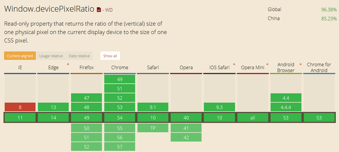
我们来测试不同设备上的浏览器的 window.devicePixelRatio 值是多少(Chrome控制台模拟):
| 设备类型 | devicePixelRatio |
|---|---|
| PC | 1 |
| Response | 2 |
| Nexus 6P | 3.5 |
| iPhone6 | 2 |
| iPhone6 Plus | 3 |
| iPad | 2 |
看了这些之后,应该知道正常的网页中的图片如果放到手机或者平板等配备高分辨率屏幕设备中,如果不加处理,显示尺寸肯定会变小。
OpenLayers3 切片地图在高分辨率屏幕下的显示问题
OpenLayers3 默认基于 Canvas 渲染切片地图,加载的切片地图本质上是图片,大小一般是 256*256,可以想象在高分辨率显示设备中 Canvas 加载的图片会有缩小。可是我们想在不同的设备中的浏览器有相同的行为,帅气的 Canvas 标准早已经意识到了这一点,它在规范中说:
The user agent must use a square pixel density consisting of one pixel of image data per coordinate space unit for the bitmaps of a canvas and its rendering contexts.
这段的大意是必须让分辨率高于图像的显示设备中的“一块”像素表示图片中的一个像素。
帅气的 OpenLayers3 开发组肯定是看过这一段话的,所以他们首先在 map.js 中第 155行~160行写下了这几行:
  /**
   * @private
   * @type {number}
   */
  this.pixelRatio_ = options.pixelRatio !== undefined ?
      options.pixelRatio : ol.has.DEVICE_PIXEL_RATIO;
这允许用户在 map 初始化时传入这个比例值,如果用户没有指定,就取值为 window.devicePixelRatio,这个值做什么用呢?于是它们又在 1217 行到 1304 行,将该参数组装成一个 frameState 对象,第1278 行调用了 this.renderer_.renderFrame(frameState);,这一行便涉及到了渲染,打开ol/renderer/canvas/map.js,第 153 行到 162 行:
  var context = this.context_;
  var pixelRatio = frameState.pixelRatio;
  var width = Math.round(frameState.size[0] * pixelRatio);
  var height = Math.round(frameState.size[1] * pixelRatio);
  if (this.canvas_.width != width || this.canvas_.height != height) {
    this.canvas_.width = width;
    this.canvas_.height = height;
  } else {
    context.clearRect(0, 0, width, height);
  }
这里将 canvas 的尺寸相对于 Canvas 的父元素进行了等比例放大,这样 Canvas 中绘制的图片在不同分辨率中的大小就会 一致。
熟悉 Canvas 元素的可能知道,它有一对属性版本的 width 和 height,控制着 Canvas 的绘图区域大小,CSS 的 width和 height 也控制着元素的尺寸,规范中说到:
The canvas element has two attributes to control the size of the element’s bitmap: width and height. These attributes, when specified, must have values that are valid non-negative integers. The rules for parsing non-negative integers must be used to obtain their numeric values. If an attribute is missing, or if parsing its value returns an error, then the default value must be used instead. The width attribute defaults to 300, and the height attribute defaults to 150.
The intrinsic dimensions of the canvas element when it represents embedded content are equal to the dimensions of the element’s bitmap.
A canvas element can be sized arbitrarily by a style sheet, its bitmap is then subject to the ‘object-fit’ CSS property.
大意是当 Canvas 属于内嵌元素时,那么它的坐标绘图区域初始尺寸等于其属性 width 和 height 规定的值,但是如果规定了 CSS 的 width 和 height,Canvas 的绘图区域就会只保留 CSS 规定的尺寸。所以,OL3 中的下列代码:
var width = Math.round(frameState.size[0] * pixelRatio);
var height = Math.round(frameState.size[1] * pixelRatio);
if (this.canvas_.width != width || this.canvas_.height != height) {
    this.canvas_.width = width;
    this.canvas_.height = height;
}
map.js 43~50 行
  /**
   * @private
   * @type {HTMLCanvasElement}
   */
  this.canvas_ = this.context_.canvas;

  this.canvas_.style.width = '100%';
  this.canvas_.style.height = '100%';
保证了 OpenLayers3 可以在不同的设备的浏览器中有一致的表现,而且不会超出地图区域,因为保留了 CSS 规定的等于父元素尺寸,所以有一个截断过程。这就要求你要规定好 ID 为 map 的元素的高度为固定值,笔者之前设置了让 td 元素容纳地图,结果地图竖直方向出现了拉伸,因为 Canvas 竖直方向乘以了系数,进行了拉伸,这时,td 也被拉伸了,竖直方向没有了 CSS 的高度截断功能,所以最终出现了拉伸。
解决方案也很简单,有两种,一是初始化 map 时手动设置 pixelRatio 值为1,这样不会出现拉伸,这样的缺点是不同分辨率的设备上显示不一致,高分辨率下切片会变小;另一种就是设定好 map 元素的高度。
总结
原来一个简单的问题,引出了一大片的深层知识。平时还是要关注小的细节,挖掘的深一点。
转载自:https://blog.csdn.net/qingyafan/article/details/52918447